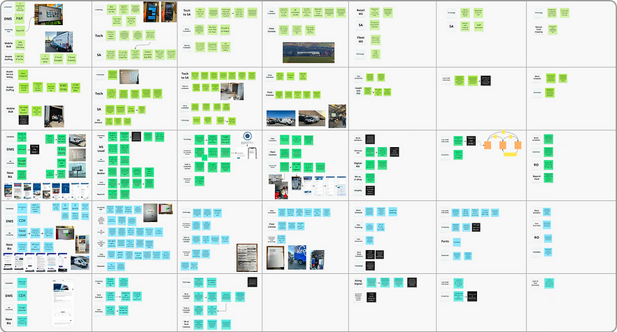
Technician
Portal
providing digital tools for underserved mobile technicians

Role: Lead Product Designer & UX Strategist
Company: Ford Motor Company (via VML)
Timeline: 2 years, ongoing
Scope: Mobile web platform for dealership service operations
Impact at a Glance
-
Empowered mobile technicians with real-time workflow visibility and field autonomy
-
Eliminated paper repair orders across Ford's mobile service network
-
Reduced reliance on service advisor availability for in-field decisions
-
Established a scalable mobile-first foundation for future service tools
-
Enabled in-field service additions, increasing revenue capture opportunities
A previously underserved user was finally in the driver's seat.
My Role & Scope
I served as Lead Product Designer and UX Strategist, responsible for establishing the end-to-end mobile experience for the Technician Portal — from initial field research through design, testing, and ongoing iteration.I was responsible for:
-
Conducted dealership visits and technician shadowing to observe real field conditions
-
Led user interviews, anonymous surveys, and Instapanel research
-
Defined the mobile-first product strategy and pushed back on initial desktop assumptions
-
Designed core workflows: schedule, repair orders, customer communication, service additions
-
Created wireframes, prototypes, and interaction patterns optimized for field use
-
Ran usability testing and iterative validation with working technicians
-
Partnered with stakeholders and engineering to guide implementation
-
Wrote UX copy and communication patterns throughout
The Problem
Mobile service technicians are the primary customer-facing presence during a Ford mobile service appointment. They drive to customers' homes, service their vehicles, and manage the entire experience in the field. Yet for all that responsibility, they had almost no dedicated digital tools to support their work.
Every morning, a technician's schedule arrived as a stack of paper repair orders. Communication with customers was inconsistent and manual. If a technician wanted to add a service — something as simple as wiper blades — they had to get sign-off from the service advisor back at the dealership, who was often busy and unavailable. In practice, this meant technicians were stalled in customers' driveways, waiting for permission to do their jobs.
The technician had significant customer responsibility and almost no operational authority. The product would need to fix both.


Paper Repair Order
Technician Working
Scheduled Services
The Real Challenge
The first major design decision happened before a single wireframe was drawn.
The client's initial ask was for a desktop platform. After our first dealership visits, it became immediately clear that would never work — these technicians are literally mobile, moving between appointments, working in driveways and parking lots, often with their hands full or dirty. Designing for desktop would have produced a product that looked good in a presentation and failed in the field.
Pushing back on that ask early, and making the case for a mobile-first web platform, shaped everything that followed.
Research presented its own complications. Service advisors, the technicians' direct managers, wanted to be present during every interview. Having a supervisor in the room would have killed honest feedback entirely. To work around this, we launched anonymous UserZoom surveys and Instapanel sessions in parallel with in-person visits, creating space for technicians to speak freely about what wasn't working.
What they told us was candid, specific, and occasionally blunt — exactly what good research looks like.
Discovery: Seeing the Work Before Designing for It
The most valuable research we did wasn't sitting across a table from a technician — it was shadowing them in the field. Watching a technician work through a morning of appointments revealed things no interview would have surfaced: the physical constraints of the job, the rhythm of moving between tasks, the moments where paper and verbal handoffs created friction or delay.
Three things became immediately clear:
Technicians are fully mobile. They are never at a desk. A desktop platform was off the table.
The job is physically demanding and often messy. Nobody wants to navigate a complex UI with greasy hands. Every unnecessary tap or screen transition was a design failure.
Technicians had responsibility without authority. They were the customer's primary point of contact but couldn't act independently on even minor service decisions. That imbalance needed to be resolved by the product.

Research: Creating Space for Honest Feedback
After establishing enough baseline knowledge through dealership visits, we moved into formal research — with one significant obstacle. Service advisors wanted to be present in every technician interview. We knew that dynamic would prevent the unfiltered feedback we needed.
Our solution: run multiple research streams simultaneously. In-person shadowing continued, while anonymous UserZoom surveys and Instapanel sessions gave technicians a private channel to share what they actually thought. The combination gave us a full picture no single method could have provided.
What technicians told us was clear and consistent:
"Whatever you build, keep it simple."
"Going digital would absolutely make things a lot easier and definitely better for the customer."
"Scheduling is fluid — it has to be to an extent. It's not one size fits all."
"Automated messages to customers would be very helpful."
"We have to have a block schedule for some appointments — it doesn't work any other way."
The persona that emerged from this research — Cameron, a mobile service technician — captured the core tension of the role: someone with a lot of customer responsibility and almost no tools or authority to back it up.
Cameron wants:
-
To move out of the paper era and into the current century
-
Technology that helps him manage his appointments without going through a middleman
Cameron needs:
-
To communicate clearly and proactively with customers
-
The ability to safely and efficiently complete his work on site
Cameron's biggest frustration:
-
Being beholden to the service advisor to add services or create repair orders while in the field — significant responsibility, minimal authority
From Insights to Product Decisions
Every major design decision traced directly back to something a technician told us or something we observed in the field.
Insight → Decision → Impact
Insight: Technicians were fully mobile and never near a desktop computer.
Decision: Pivoted to a mobile-first web platform optimized for on-the-go use, overriding the client's initial desktop request.
Impact: Enabled technicians to manage their full workday directly from their phones in the field.
Insight: Technicians relied on paper repair orders handed to them each morning.
Decision: Designed a digital schedule with at-a-glance appointment visibility and only the critical information needed to plan the day.
Impact: Eliminated paper workflows and gave technicians instant clarity on their schedule without sorting through a physical stack.
Insight: Technicians lacked authority to add services during appointments without service advisor approval.
Decision: Enabled in-flow service additions and repair order updates directly within the portal.
Impact: Increased technician autonomy, reduced stall time during appointments, and created new revenue capture opportunities for dealerships.
Insight: Technicians worked in physically demanding, often messy conditions — nobody wants to navigate a complex UI with greasy hands.
Decision: Radically simplified interaction patterns and automated progress wherever possible to minimize required inputs.
Impact: Reduced cognitive and physical friction during active appointments, keeping focus on the work, not the screen.
Insight: Communication between technicians, service advisors, and customers was inconsistent and manual.
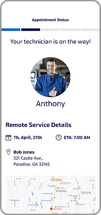
Decision: Implemented automated "On the Way" messaging that sends the customer an ETA and technician introduction without any manual action required.
Impact: Improved customer confidence and reduced the coordination burden on technicians mid-route.

Schedule: Built for a Glance, Not a Study
Early wireframes for the schedule were too cluttered — technicians were direct about it, and they were right. In a fast-moving field environment, extra information isn't helpful; it's noise. I stripped the schedule down to only what a technician needed to understand their day at a glance: appointment times, customer names, locations, and job type. Visual separation between appointments used a simple blue bar system. Bottom navigation was removed entirely in favor of a hamburger menu, maximizing usable screen space.

Repair Order: Field-Ready Context
When a technician arrives at a job, they need customer and vehicle information immediately — not buried three screens deep. I designed the repair order overview to surface the most critical details at the top, with a single "Start Travel" button that triggers the automated customer message. The layout was structured for one-handed use, accounting for the physical reality of someone managing a phone while moving between tasks.

Customer Communication: Automated, Not Manual
Previously, keeping customers informed was an ad hoc process — a call if there was time, nothing if there wasn't. I replaced that with an automated messaging system tied to appointment status: when a technician hits "Start Travel," the customer receives an "On the Way" message with the technician's ETA and identity. No manual action required. The customer is informed, the technician keeps moving.
Key Design Decisions

Add Services: Authority in the Field
One of the most important features wasn't visually complex — it was organizationally significant. Enabling technicians to add services directly to an appointment, without routing back through a service advisor, fundamentally changed the power dynamic of the role. Technicians could now respond to what they found on a vehicle in real time, which improved customer experience and created new revenue opportunities that had previously been lost to process friction.
Find Vehicle & Digital VCU
Technicians needed to search for and add vehicles to appointments on site — by VIN entry or camera scan. The digital Vehicle Check Up, still in progress at time of writing, addresses one of the most consistently requested features across every research session: replacing the paper VCU with a tap-based digital version that integrates directly with dealership systems.


Impact & Outcomes
The Technician Portal transformed how Ford's mobile service technicians manage field appointments — replacing paper workflows with a mobile-first platform built around how the work actually happens.
Operational
-
Eliminated paper repair orders for technicians on the mobile service network
-
Streamlined daily scheduling and appointment planning
-
Reduced technician dependency on service advisor availability for in-field decisions
-
Enabled real-time appointment progress visibility across the service chain
Technician Experience
-
Gave technicians genuine autonomy during mobile appointments for the first time
-
Reduced friction between technicians and the service advisors managing them remotely
-
Simplified interaction patterns for a physically demanding, fast-paced environment
-
Empowered in-field service additions and repair order updates
Customer Experience
-
Introduced automated "On the Way" messaging with ETA and technician identity
-
Improved transparency and predictability during mobile service visits
-
Reduced manual communication overhead without sacrificing customer confidence
Platform Foundation
-
Established a mobile-first architecture with flexibility for ongoing feature expansion
-
Ongoing: transition from Pega to ReactJS will unlock additional design flexibility
-
Pipeline features include remote payment acceptance and on-site follow-up appointment scheduling — creating a true end-to-end mobile service experience
What I Learned
The insight that stayed with me longest from this project wasn't about design patterns or mobile ergonomics — it was about how much you can miss if you only do interviews.
Shadowing technicians in the field changed everything. You can ask someone to describe their day and get a reasonably accurate account. But you cannot ask someone to describe the feeling of trying to navigate a poorly designed UI with dirty hands, standing in a customer's driveway, running behind. You have to see it. The "nobody wants to touch their phone with greasy hands" realization sounds simple in retrospect, but it only came from being there.
The other thing this project reinforced: research access is a design challenge in itself. When managers want to sit in on every interview, you don't abandon the research — you find another way. Anonymous surveys and Instapanel sessions gave technicians a channel to tell the truth, and the product is better because of it.
This is an ongoing project, and that feels right. The best service experiences aren't launched — they're continuously refined. The consortium of service advisors we established for monthly feedback is the right model: real users, regular touchpoints, and a product that keeps getting better.